How to Create a Realistic Pastel & Charcoal Portrait on Black Paper – “Eyecon “Singer”Art Tutorial
- Marco
- Nov 23, 2025
- 3 min read
Updated: Jan 2


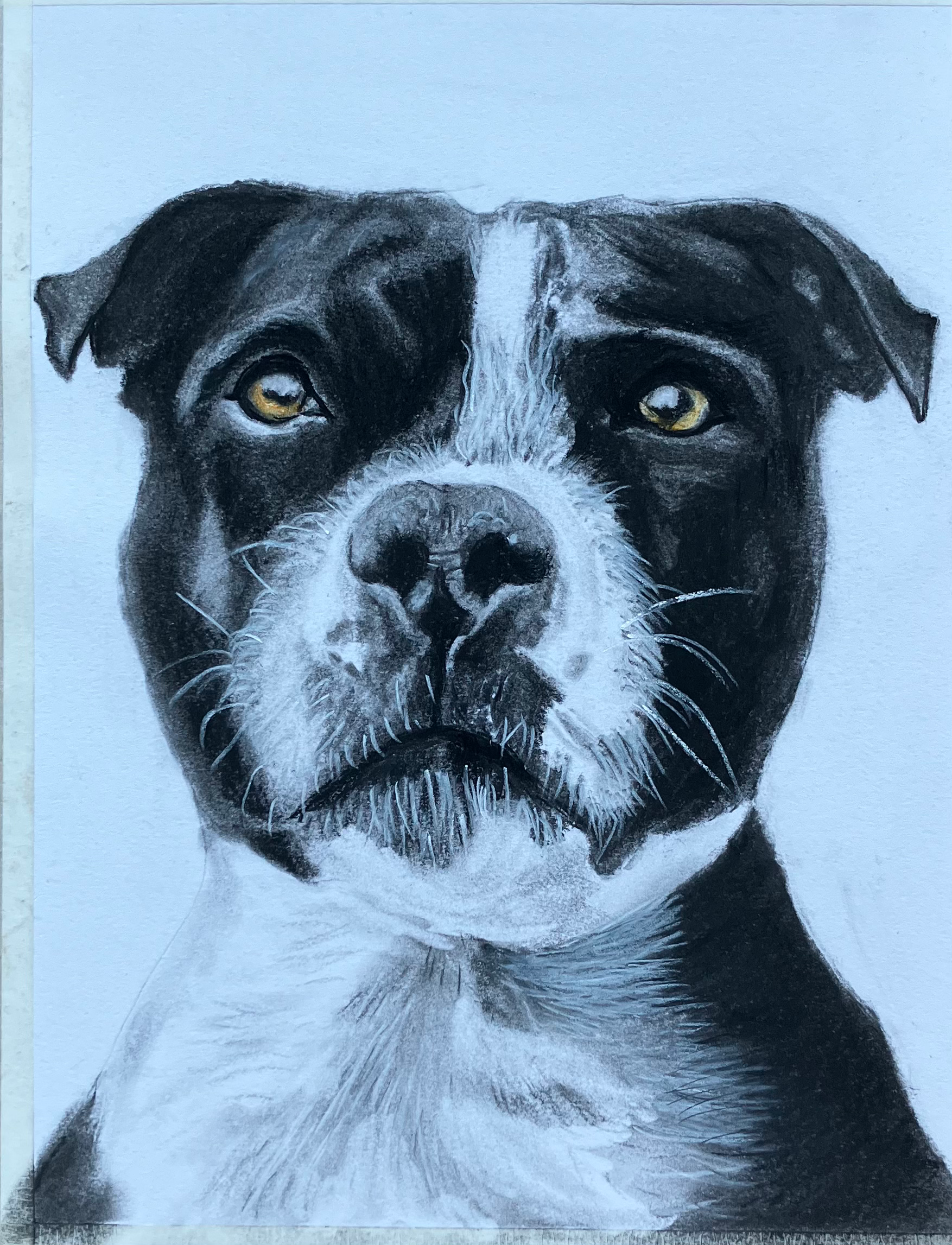
Please note these images are not endorsed by the subject used.
Looking for a dynamic and striking way to showcase a subject using pastel and charcoal on black paper? In this tutorial, artist Marco walks you through the step-by-step process of creating a high-impact, half-face portrait from the Eyecon series – the “Singer” edition. You’ll learn the essential materials, layering techniques, and tips for working on a dark substrate to ensure stunning results.
🎨 Materials You’ll Need to create your own Eyecon
Black pastel paper – I used Canson Mi-Tientes (160 gsm, 32 × 41 cm) for the deep black tone as the base.
Low-tack masking tape – For preserving untouched areas of the paper and protecting the surface before applying pastel layers.
Pastel colours – Selected shades for building highlights and mid-tones: white, yellow ochre, light grey.
Pastel pencils – For detailing: white (101), cream (102), black (199), cold grey (230), pink carmine (127), light ultramarine (140).
Step 1: Sketching & Masking is essential when creating a pastel and charcoal portrait on black paper

Start with a clear outline of your subject. I create my Eyecon style by taking half of the reference image and using a focal-point grid to map the composition.
Once the sketch is in place, use low-tack tape on the portion of the paper you intend to leave untouched (in my case, the left-hand side). Then apply conventional masking tape and protective paper to shield surrounding areas.
When working on black paper, keeping the untouched zones pristine is vital to maintaining the high-contrast effect.
TIP: To remove stray specks of charcoal or pastel on the paper, lift the work off the desk or work surface and gently tap the back rather than blowing or wiping – this avoids marks. I also use a sticky rubber eraser to lift off any loose bits. Dab though, don’t rub.
You can see a few specs on the black background in the picture below. I lifted these off with a mouldable rubber by dabbing the surface. Warm the rubber to improve its adhesive properties. I sit mine on the radiator in my studio or hold it in my hand for a few minutes.
Step 2: Layering & Blending Pastels plus Lifting Off.
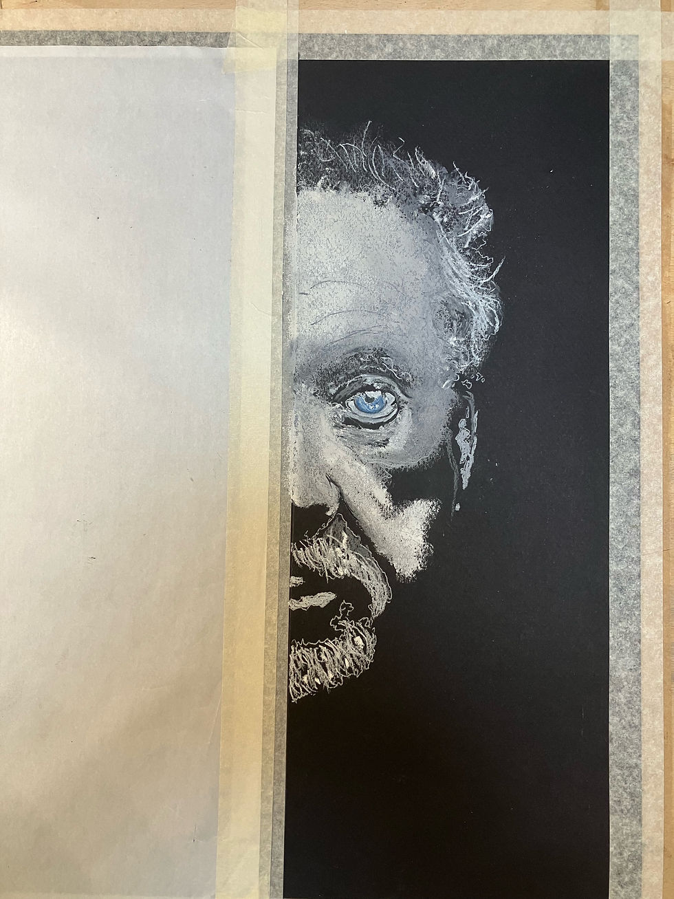
With the base prepared, begin layering colour. For dark paper, think of the process as “drawing out the light” rather than shading the dark. I started with soft white, layered light grey, then blended.
Blending is crucial: However once you apply pressure to pastel on black paper, it adheres quickly, so add your various blends of colour first. To blend use your finger, a torchon, or silicon blender — each gives a different effect. The trick is to apply the right pressure and build gradually.
Pro Tip. Practice on a spare piece of paper first before blending. This allows you to decide on the pastel or charcoals to blend and test the surface finish you are looking to achieve.
Step 3: Final Touches – Defining Features & Textures

Now that the surface is built up, time to refine. Add wrinkle lines, define hair strands and whiskers (if applicable), sharpen edges, enhance contrast. In this piece the final touches really bring the facial features forwards from the dark background.
After this, you can consider applying a fixative — but lightly! Too much spray may shift pastel particles or dull the black ground.
Why the Eyecon Series Works
The Eyecon series is about bold experimentation:
Unfamiliar substrates (ie. black pastel paper)
A reverse-pastel technique (drawing light into dark)
Dramatic chiaroscuro lighting for maximum visual impact.
These original pieces are not for sale — they’re development works. But they serve as inspiration (and commission samples) for your own custom pieces: if you have a full-face photograph of a subject, I can adapt your image into an Eyecon portrait.
Final Thoughts & Pro Tips
Go slow with layers: building gradually prevents over-loading the dark paper and better preserves the luminous effect.
Protect your paper surface: correct masking and handling make a big difference when working with such high-contrast media.
Focus on the light: on black paper, the brightest tones define the form, so choose your white and light greys wisely.
Keep small tools handy: torchons and fingers for blending finer areas, silicon blenders where you need more control.
Consider commissioning: if you like this style and want a bespoke piece, drop me your reference photo and let’s talk.
Hope you found this tutorial helpful and inspiring! If you try the technique, feel free to share your results or ask any questions below.
For more information about this Welsh Icon
Marco


Comments